Make navigation around your venue easier


COVID-19 update: Not all of these tips might be relevant at the moment while individuals isolate and practice social distancing. Something you can do is to make sure your disabled access information is listed online, on your own website and on Euan's Guide. It is also important to regularly check this information to make sure it is kept up to date. This is a great step in assisting anyone considering visiting your venue when it is safe to do so.
No matter how small or large your venue is, it’s important that people know how to find their way around. Whether they’re running late to a movie, trying to find the public bathrooms, or leaving the building in an emergency; visitors to your building shouldn’t be going round in circles to get where they need to go! Guide your visitors with these top tips for making navigation easier for everyone.
1. Set the scene
If you can see someone arriving at your venue, make them feel welcome by saying hello and pointing out where amenities and places of interest are. You can even go the extra mile and offer to show guests to their destination! Setting the scene is a great way to make visitors feel comfortable in your venue, so don’t be afraid to tell wheelchair users where the nearest lifts are, describe the building to visually impaired people, and let hearing impaired visitors know if there is a hearing loop; these are just some ways you can start off on the right foot when it comes to disabled access!
2. Think about lighting and glare
Wherever possible, try to keep an even distribution of lighting levels throughout your corridors and hallways. Spots where there is a sudden drop in brightness, or increased glare can disorient some visually impaired people and make it trickier to follow a route. Maintain lightbulbs and drop window shades if it is exceptionally bright outside. Don’t forget that interiors with highly reflective surfaces, either with lots of glass or tiled floors, can create difficulties for many visually impaired people as well; so try to minimise this where possible.
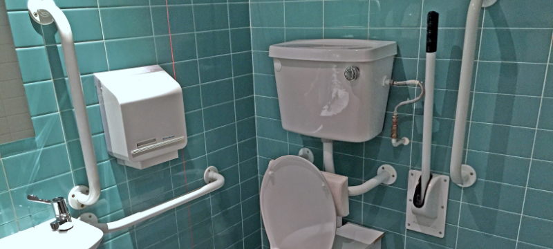
Remember to think about light and dark surfaces around your venue too. It’s important to have a contrast between walls and floors as this makes it easier for people to follow corridors, particularly for visually impaired people. This is a common issue in toilets where both the walls and floors are white or light making the room appear like a white box.

Image of: An accessible toilet with contrasting green tiles and white toilet and grab rails.
3. Have fun with adapted maps
If your venue is particularly large and you have visitor maps, can you offer alternative formats of this information? Colourful maps with contrasting labels and large print can be helpful to visually impaired people, as can touch model maps. Touch models can double up as cool sculptures in your lobby or reception! Eden Project in Bodelva has a metre-long touch scale map of its landscape. The map was crafted out of wood offcuts, including ash, mahogany, cedar and more; and to avoid splinters, the map was covered in beeswax to smooth out any rough edges. Not only is it a useful navigation tool, but a work of art.
4. Say it with a sign
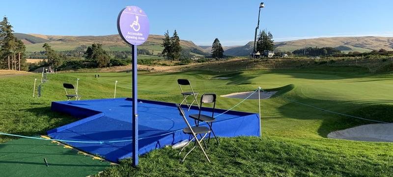
Signs around your venue are a great for guiding people, if they’re done well! Large, clearly printed signs with a pictorial element are best. Pictures also make it easier for people who do not speak English as a first language to work out where they’re going. Don’t forget to say where something leads, so if you have a sign pointing to a ramp, can you say where the ramp is going? It could be a ramp leading to a fire exit which, in the case of a non-emergency, is essentially a dead end. On the other hand, it could be a ramp leading to a café, which is far more appealing and doesn’t take guests on an unnecessary detour.

Image of: Signage at The 2019 Solheim Cup.
5. Let lifts do the talking
Does your venue have lifts? Give them some personality! Voice announcements are a helpful feature of elevators that indicate to people when they need to vacate the lift. Braille text on elevator buttons is another great feature that lifts should have for visually impaired people moving between floors.
6. Keep routes free from obstruction
Important for emergencies, and necessary for many disabled people; corridors should be kept free from obstructions such as cleaning equipment or deliveries waiting to be unpacked. Have a system in place for deliveries so that large boxes can be stacked in a designated space that isn’t in anybody’s way. Try also to keep doors propped open where possible if your building isn’t fitted with automatic doors.
7. Prepare for emergencies
Thankfully, emergencies are rare, but it’s always good to be prepared! Keep Personal Emergency Evacuation Plans (PEEPs) at your reception or sign-in desk in large buildings. Offer these to visitors as necessary, and keep them updated with any changes to your building or evacuation plan so that people know how to navigate to the nearest exit.


 Follow Euan's Guide on Instagram
 Follow Euan's Guide on LinkedIn
 Follow Euan's Guide on Facebook

